
You've probably had this moment already. Someone sends you a spreadsheet exported from Xero, Sage, QuickBooks, or a payroll system, and asks for a quick...
You've probably had this moment already. Someone sends you a spreadsheet exported from Xero, Sage, QuickBooks, or a payroll system, and asks for a quick summary by customer, department, VAT code, or pay period. The file looks simple at first. Then you scroll. And scroll again.
At that point, most junior staff do one of two things. They either start building long formulas and filters by hand, or they freeze because the workbook feels too messy to trust. A good PivotTable changes that. It helps you turn raw transactions into a report you can explain with confidence.
If you want an Excel Pivot Tables tutorial that reflects real UK finance work, not classroom-only examples, the skill becomes useful. You're not just learning a feature. You're learning how to summarise bookkeeping data, review payroll outputs, support final accounts, and answer ad hoc questions that come from managers who want a clear answer today.
From Data Overload to Powerful Insights
A PivotTable earns its place the first time you need to summarise a large ledger quickly and you don't want to risk formula errors. Microsoft describes PivotTables as a way to calculate, summarize, and analyze worksheet data, with tools such as Show Values As and Recommended PivotTable that speed up reporting work (Microsoft PivotTable guidance).
That matters in junior finance roles because the work rarely arrives in a tidy management report. It arrives as exported transactions. Sales invoices. Purchase ledger lines. VAT detail. Payroll journals. A good accounts assistant doesn't just enter data. They turn it into something a manager can review.
For learners aiming at bookkeeping, VAT, payroll, accounts assistant, business analyst, or data analyst roles, PivotTables sit in the middle of that transition. They help you move from processing to analysis. If you're also thinking about where these reporting skills can lead over time, this overview of the future of BI careers and salaries gives useful context on how spreadsheet reporting links to broader analysis careers.
Why employers care about this skill
In practice, employers want someone who can answer questions such as:
- Sales review: Which customers generated the highest invoice totals this month?
- VAT checking: Which transaction types are sitting under each VAT code?
- Payroll analysis: How do gross pay, deductions, and employer costs compare by department?
- Final accounts support: Which nominal codes are driving unexpected movement?
- Business analysis: Which region, product line, or period needs further review?
These aren't advanced data science tasks. They're daily reporting tasks. But they're the tasks that make you useful very quickly.
Practical rule: If you're still building repeated SUMIF formulas to answer summary questions from transaction data, you're doing analyst work with data-entry tools.
The strongest learners usually combine Excel with wider digital accounting skills. If you want a broader view of how spreadsheets fit into finance systems, this guide to technology for accounting is a sensible next read.
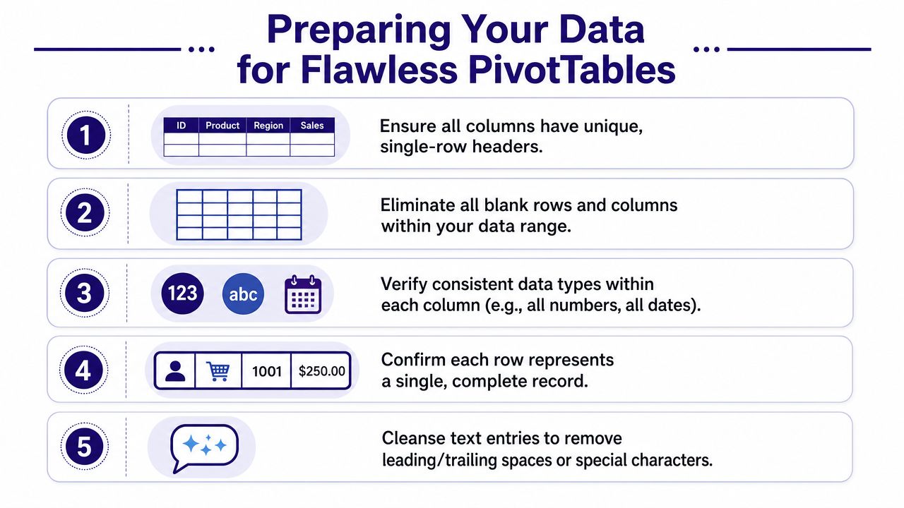
Preparing Your Data for Flawless PivotTables
Most PivotTable problems start before you insert anything. The issue is usually the source data. A recurring gap in many tutorials is that they show the drag-and-drop steps but skip the reasons PivotTables fail in live workbooks, especially with non-tabular ranges, blank rows or columns, and missing headers (discussion of real workbook failure points).
That's why experienced finance staff spend time checking the export first. It feels slower at the start, but it saves time when the report needs to refresh later.
The pre-check that prevents most errors
Use this checklist before you build your first summary:
- One header row only: Every column needs a clear label in a single top row. If your export has title rows, blank separator rows, or notes above the data, remove them first.
- No gaps in the middle: Blank rows and blank columns can break the range and confuse Excel.
- One row equals one record: Each row should represent one invoice line, one transaction, one employee record, or one journal line. If one record is spread across several rows, your summary won't be reliable.
- Keep each column consistent: Dates should be dates, amounts should be numbers, and text fields should not contain a mix of labels that mean the same thing.
- Avoid merged cells: They look neat on screen and cause problems in analysis.
What often goes wrong in accounting exports
Files exported from bookkeeping or payroll software often look usable but aren't ready yet. A VAT export might contain subtotal lines. A sales ledger might include blank rows between customers. A payroll sheet might contain mixed date formats or repeated headings copied into the middle of the report.
Those issues matter because PivotTables work best when the source is shaped like a database table. Clean columns. Clean rows. No decoration.
A workbook can look polished and still be structurally wrong for analysis.
Why Excel Tables are the safer default
If you do one thing before creating a PivotTable, make the source range into an Excel Table. That gives you a source that expands more safely when new rows are added later. For month-end reporting, that's a practical habit, not a technical extra.
A simple workflow for junior staff is:
- Clean the exported data.
- Click anywhere inside it.
- Format it as an Excel Table.
- Give the table a sensible name.
- Build the PivotTable from that table, not from a loose range.
This is especially useful for recurring reports such as monthly bookkeeping reviews, payroll cost summaries, or management accounts support. If you're building job-ready spreadsheet habits, the training advice in Excel for accounting is worth keeping alongside your practice.
Creating Your First Financial Summary
It's 9:10 on a Monday morning. Your manager wants a quick view of sales by customer before the weekly finance meeting, and the export in front of you has hundreds or thousands of rows. You could start building SUMIFS formulas across a new sheet, but for this kind of job a PivotTable is usually faster, easier to check, and easier to update when fresh data arrives.
A good first PivotTable answers one plain-English question. In a sales invoice listing with fields such as Invoice Date, Customer Name, Region, VAT Code, and Invoice Amount, the question might be: Which customers generated the most sales? Once you frame it that way, the setup becomes much clearer.
Build the first summary the way you would at work
Use the manual method first. It teaches you how the report is assembled, which matters when you later need to fix someone else's workbook.
- Click anywhere inside your cleaned data or Excel Table.
- Go to Insert and choose PivotTable.
- Keep the default option to place the PivotTable on a new worksheet.
- In the field list, drag Customer Name to Rows.
- Drag Invoice Amount to Values.
You now have a customer sales summary.
That may look almost too simple, but that is the point. A PivotTable works like a fast sorting and totaling clerk. You give Excel one field to group the records and one field to total, and it builds the schedule for you.
Read the four areas like job instructions
The field list confuses many new users because the labels are technical. In finance work, it helps to translate them into practical reporting tasks.
- Rows: what you want listed down the left. Examples include customer, supplier, nominal code, department, or employee.
- Columns: what you want split across the page. Examples include month, quarter, region, or pay type.
- Values: what you want calculated. This is often sum of sales, sum of net amount, count of invoices, or average pay.
- Filters: what you may want to narrow without rebuilding the report. Examples include VAT code, branch, year, or payroll period.
A simple rule helps here. Ask yourself: What am I grouping by, and what am I measuring? The grouping field goes in Rows or Columns. The number you want calculated goes in Values.
Start with one clear bookkeeping question
For month-end bookkeeping support, a practical first report might be purchase spend by supplier.
- Put Supplier Name in Rows.
- Put Net Amount in Values.
- Put VAT Code in Filters.
That gives you a quick supplier summary and lets you check one VAT category at a time. If the input data is sound, you can spot unusual spend, suppliers with higher activity than expected, or transactions posted to the wrong VAT treatment.
The same approach works for payroll analysis. If a finance manager asks for a departmental pay summary, use:
- Department in Rows
- Gross Pay in Values
- Pay Period in Filters
That is the kind of report junior finance staff are often asked to produce at short notice.
Fix the first problem you are likely to meet
If Excel puts Invoice Amount or Net Amount into Values as Count instead of Sum, treat that as a warning sign. Excel usually does this when the source column contains numbers stored as text, blank cells in the middle of the range, or mixed entries such as words and amounts in the same field.
Do not patch over it inside the PivotTable if you can avoid it. Go back to the source data and inspect the amount column. In real accounting exports, this often happens because a report includes a stray subtotal row, a text note typed into the amount column, or an apostrophe forcing numbers to behave like text. Fixing the source gives you a report you can trust.
Another common confusion is seeing a total that looks too high. In practice, that often means the export contains duplicated transactions, credit notes mixed with invoices, or lines from more than one period. The PivotTable has done the maths correctly. The issue is usually in the underlying data or in the question being asked.
Use Recommended PivotTable with judgment
Recommended PivotTable can be useful when you are still learning or when you want a quick starting point. It shows how Excel interprets your fields and may suggest a layout that saves time.
Treat it like a trainee's first draft. Review it, then adjust it so it matches the business question. In finance and data roles, a report is only useful if it answers the question your manager asked.
If you want to watch the process in action before practising it yourself, this walkthrough is a helpful visual reference:
Shaping Your Report with Layouts and Grouping
A basic PivotTable is functional. A polished one is easier to review in a meeting, easier to export, and easier for someone else to understand. That's where layout choices and grouping start to matter.
Pick a layout that suits the report
The default layout isn't always the clearest. In finance work, I usually want the report to read like a proper schedule rather than a compressed list.
The main options are:
- Compact form: Good for quick on-screen review, but it can be harder to read when you have several row fields.
- Outline form: Better when you want clearer hierarchy between grouped fields.
- Tabular form: Often the best choice for reports that might be copied into management packs or checked line by line.
If you're supporting final accounts or departmental analysis, Tabular form is usually the easiest for another person to follow.
Group dates into reporting periods
Date grouping is one of the most useful skills for accounts work. Daily transaction dates rarely help a manager. Monthly or quarterly totals do.
A practical example is a sales ledger with invoice dates. If you place the date field into Rows, Excel may show every single date. That's technically correct and practically unhelpful. Grouping lets you turn those dates into months or quarters.
This is especially valuable for:
- Management accounts: month-by-month income or cost review
- VAT review: checking activity by period
- Payroll analysis: comparing pay runs over time
- Business analysis: spotting trends without editing the source file
When a manager asks for a trend, they almost never want a list of daily dates. They want the pattern in a reporting period they recognise.
Group values to tell a clearer story
Grouping isn't only for dates. You can also group numeric values into bands. That's useful when you want to classify transactions or customers into ranges rather than inspect every individual number.
For example, in a customer sales review, grouping invoice or sales values into bands can help you separate small, medium, and high-value accounts. In payroll, you might group overtime cost ranges. In bookkeeping, you might review expense transactions by size to focus attention on larger entries first.
If grouping fails, check the source data. Mixed types and blanks are common causes of trouble, particularly when exported files contain hidden inconsistencies.
Make the output easier to present
A few simple presentation habits go a long way:
- Rename field captions so they read clearly in the report.
- Apply number formatting at the PivotTable level, especially for currency.
- Use subtotals only when they add value. Too many subtotals can make the report harder to scan.
- Sort by value when the business question is about the biggest items.
A good PivotTable should answer a question quickly. If the person reading it has to decode the layout first, it needs more work.
Unlocking Insights with Slicers and Calculated Fields
Once your PivotTable works, you can turn it into something far more useful for managers and clients. The report then stops being static and starts becoming interactive.
For UK learners in finance, accounting, or business analysis, the highest-value advanced PivotTable skills are slicers, calculated fields, and grouping. Slicers can also be connected across multiple PivotTables through Report Connections, which turns a fixed summary into an interactive dashboard (advanced PivotTable techniques).
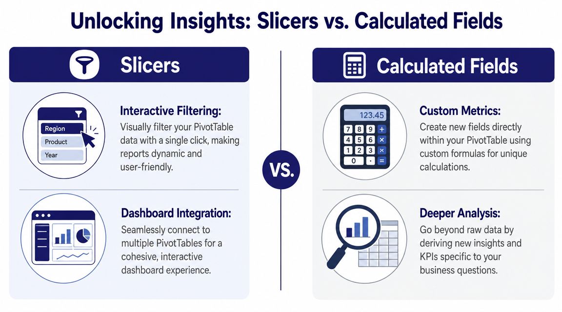
Use slicers when other people need to interact with the report
A slicer is a visual filter. Instead of opening a drop-down list inside the PivotTable, you click a button such as Region, Department, VAT Code, or Month. That makes the workbook much easier to use in meetings or handovers.
Slicers are especially good when:
- A manager wants self-service filtering: They can switch the report view without touching the field list.
- You have more than one PivotTable on a dashboard: The same slicer can control multiple summaries through Report Connections.
- You need a repeatable reporting pack: The report stays structured, and the filters are easy to see.
A useful finance example is a monthly dashboard with one PivotTable showing sales by customer and another showing sales by product group. Connect a Region slicer to both, and the whole dashboard responds together.
When to choose a slicer instead of a filter
Use a normal report filter when the workbook is mainly for you. Use a slicer when someone else needs to interact with it quickly.
That distinction matters in the workplace. Junior analysts often overuse hidden filter drop-downs. A slicer gives a cleaner and more reproducible experience, particularly in recurring reporting.
Workplace habit: If your manager needs to click around during a meeting, use slicers. If the report is for your own checking only, a standard filter may be enough.
Calculated fields for finance logic inside the PivotTable
A calculated field lets you create a new metric from the fields already in the PivotTable. You add it from PivotTable Analyze > Fields, Items, and Sets. This can save you from editing the source data every time you need a new reporting angle.
In finance training, learners begin to think like analysts rather than spreadsheet operators.
A practical example is a sales summary that already contains Net Sales. You can add a calculated field for VAT using your organisation's reporting logic. If your scenario uses VAT at 20%, you can calculate that directly from Net Sales inside the PivotTable. That's useful for training exercises in bookkeeping and VAT review because it shows how summary calculations relate to the underlying transactions.
You can use the same idea in other contexts:
- Payroll: a commission-style metric based on revenue
- Accounts assistant work: a variance-style field for review purposes
- Business analysis: derived measures that aren't present in the raw export
A simple example with business logic
Suppose your source includes:
| Field | Example content |
|---|---|
| Customer Name | Alpha Retail |
| Region | North |
| Net Sales | Transaction values before VAT |
You build a PivotTable with Customer Name in Rows and Net Sales in Values. Then you create a calculated field for VAT based on Net Sales. The result is a summary that shows both the original measure and the derived one without adding helper columns to the source sheet.
That's neat, but it only works well when your source data is clean. Calculated fields depend on reliable labels and numeric fields. If the source is messy, the calculation may still run but the report won't be trustworthy.
Keep advanced features controlled
Advanced tools are powerful, but they're also where junior users can make reports harder to maintain. A few limits help:
- Name slicers clearly: If you add several, people need to understand them at a glance.
- Use calculated fields for stable logic: Don't pile on too many one-off formulas.
- Avoid manual tweaks that break refreshability: Reproducible reports are better than clever-looking reports.
The strongest reporting habit is simple. Build the base summary first. Then add interactivity only where it helps someone answer a real question faster.
Visualising Sharing and Refreshing Your Analysis
A good PivotTable doesn't finish as a grid. In most roles, it needs to become a report someone can review, discuss, and reuse. Modern Excel workflows combine PivotTables with filters, slicers, and timelines to answer business questions faster, and the most job-relevant skill is using them to produce repeatable, presentation-ready analysis for employers and clients (modern Excel workflow discussion).
Turn the summary into a chart people can read
A PivotChart is usually the easiest next step. Because it's linked to the PivotTable, it updates when you change filters or slicers. That makes it useful for a simple dashboard in finance or management reporting.
Examples that work well:
- sales by month
- payroll cost by department
- supplier spend by category
- VATable sales by period
Keep the chart type simple. If the question is about trend, use a line chart. If it's about comparison, use bars or columns.
Refreshing is part of the job
If your source data sits in an Excel Table, adding new rows becomes much easier to manage. You update the source, refresh the PivotTable, and the report pulls through the latest records. That's one of the reasons experienced users prefer a table-based source for recurring reports.
This matters in practical work such as:
- monthly bookkeeping reviews
- payroll summaries after a new pay run
- final accounts support schedules
- business analyst updates from recurring exports
A report that looks good once but can't be refreshed reliably isn't good enough for workplace use.
Essential PivotTable Keyboard Shortcuts
| Action | Windows Shortcut | Mac Shortcut |
|---|---|---|
| Refresh selected PivotTable | Alt + F5 | Use the Refresh command from the ribbon |
| Open Create PivotTable workflow quickly after selecting data | Alt, N, V | Use the Insert tab from the ribbon |
| Move between worksheet areas while reviewing output | Ctrl + Arrow Keys | Command + Arrow Keys |
| Copy report output for presentation | Ctrl + C | Command + C |
| Undo a layout change | Ctrl + Z | Command + Z |
The next step after PivotTables
Once you're comfortable with PivotTables, you're in a better position to understand broader reporting tools such as Power Pivot, the Data Model, and dashboard tools used in analyst roles. If you want to see how spreadsheet reporting connects to a wider reporting stack, this overview of what Power BI is used for is a useful next step.
The important point is this. A PivotTable isn't just an Excel feature you learn once. It's a reporting habit. Clean the data. Build the summary. Shape the layout. Add interaction where needed. Refresh confidently.
That habit will serve you well whether you're checking VAT transactions, supporting payroll analysis, preparing final accounts working papers, or stepping into a junior business analyst role.
If you want structured, job-focused support to build these skills properly, Professional Careers Training offers accountancy and digital finance training designed for learners who want practical employability, not just theory. Their programmes include bookkeeping, VAT, payroll, accounting software, Excel, and wider career support, with training shaped for people entering or progressing in UK finance and data roles.

