
Over 75% of UK quantitative finance firms now use Python as their primary tool for modelling, backtesting, and algorithmic trading, according to Quantt's 2026 guide...
You're probably already doing the hard part. You reconcile ledgers, check VAT codes, review payroll runs, and spot when a balance doesn't feel right. Yet when it's time to explain those numbers to a manager, a client, or an interviewer, a spreadsheet full of rows rarely does the job on its own.
That's where strong data visualisation earns its place. In finance and accounting, raw numbers matter, but so does how clearly you present them. A clean chart can show a payroll trend in seconds. A poor one can hide a VAT issue, confuse a hiring manager, or send a director towards the wrong decision. For trainees in bookkeeping & VAT, advanced payroll, accounts assistant work, final accounts, business analyst roles, and data analyst pathways, this isn't a nice extra. It's a practical skill that helps you communicate with confidence and progress faster.
Good data visualization best practices also make your work more credible. If you can turn a trial balance movement, cost variance, or cash trend into something a non-technical person understands straight away, you become more useful to any team. That matters in job interviews, internal promotions, and day-to-day reporting.
These nine best practices are built for the practical work finance trainees face in the UK. They'll help you present financial information with more clarity, accuracy, and professional value.
1. Choosing the Right Chart Type for Financial Data
A trainee prepares a month-end report, and the numbers are right. The manager still looks puzzled because the chart answers the wrong question. That happens often in finance. Clear reporting depends as much on chart choice as it does on correct figures.
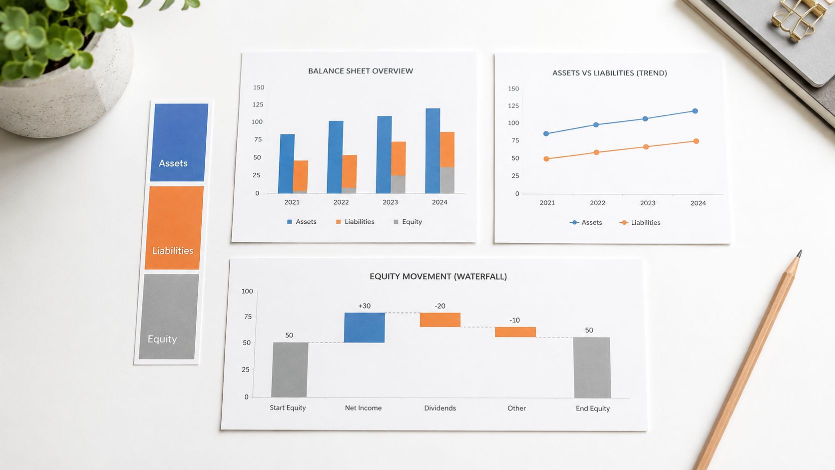
A good chart works like the right ledger code. It puts information in the place people expect to find it. If the format is wrong, your reader spends time decoding the visual instead of understanding the message.
For UK accounting and finance roles, that skill has direct career value. A bookkeeping trainee may need to compare VAT liabilities across quarters. A payroll learner may need to show how staffing costs changed over several months. An accounts assistant or junior analyst may need to explain why profit moved from one period to the next. In each case, the chart type shapes how confident and professional the explanation sounds.
Match the chart to the question
Start with the reporting question, not the software menu. Ask, what should the reader notice first?
- Comparison: Use bar charts to compare values such as supplier balances, cost centres, or VAT by quarter.
- Trend: Use line charts to show change over time, such as monthly payroll cost, recurring overheads, or sales movement.
- Movement: Use waterfall charts to explain how an opening figure becomes a closing figure, such as profit bridges or cash movement.
- Relationship: Use scatter plots when you want to check whether one variable appears to move with another, such as overtime hours and payroll cost.
This step matters because finance readers usually come to a report with a practical question in mind. Has cost increased? Which branch is under target? What caused the variance? Your chart should answer that question within a few seconds.
Pie charts often cause trouble in financial reporting because small differences between slices are harder to compare. Bar charts usually handle those comparisons more clearly. The Financial Reporting Council also stresses that charts and graphs in corporate reporting should be clear, balanced, and not misleading, which supports choosing formats that make comparisons easy to read in the FRC's guidance on the use of alternative performance measures and visual presentation in reporting.
Practical rule: If a finance manager needs extra explanation to understand the chart format, the chart is too complicated.
This is one of the habits that separates routine reporting from stronger analysis. If you are learning budgeting, forecasting, or scenario work, chart choice also connects closely with how assumptions and outputs are presented in financial modelling practice. Master it early, and you become more useful in bookkeeping, payroll, and analyst roles.
2. Maintaining Data Accuracy and Source Integrity in Visual Reports
You send a payroll cost chart to a manager at 9:10 a.m. By 9:25, they ask why the total does not match the submission file. At that point, the problem is no longer design. It is trust.
That is why finance visualisation starts with control. A clean chart can still create risk if the figure behind it has not been checked against the ledger, return, trial balance, or source export. In accounting work, a visual is part of the reporting chain, not a decorative extra.
That standard applies across common UK finance job paths. In bookkeeping and VAT work, a VAT summary chart should reconcile to the return and the supporting transaction records. In payroll, a gross-to-net visual should match PAYE submissions, pension deductions, and payment files. In final accounts or analyst work, a balance sheet or margin chart should tie back to the trial balance, adjusting journals, and the reporting period you are presenting.
Build trust into the visual
A useful way to approach this is to treat each chart like a working paper with a front cover. The audience sees the chart first, but behind it you should be able to show where the data came from, how the number was calculated, when it was refreshed, and who checked it. If you cannot explain those points quickly, the visual is not ready for wider use.
For trainees, a short reporting record is usually enough:
- Metric definition: State what the measure includes and excludes, how it is calculated, and which system or report it comes from.
- Reporting period: Record the exact date range or payroll period shown in the visual.
- Refresh detail: Note when the data was last updated and who reviewed it.
- Manual adjustments: Log any changes made outside the source system, with the reason, date, and approver.
- Version control: Use clear file names so the final copy is easy to distinguish from drafts.
Small habits prevent large errors. A chart title that says “March payroll” means little if the export includes late adjustments posted in April. A VAT visual can also mislead if one branch has missing transactions from the source report. Accuracy in visual reporting depends on labels, timing, and reconciliation, not only formulas.
Source integrity also affects how employers judge your readiness. An accounts assistant who can explain why a dashboard total matches the ledger is already showing skills used in month-end work. A payroll administrator who keeps a clear trail of adjustments is easier to trust with exception reporting. A junior analyst who can defend the source of every metric is building the habits needed for forecasting, board packs, and audit support.
A finance chart should answer two questions at once. What does this show, and where did it come from?
That approach helps your career because it shows more than software ability. It shows control, judgement, and reliability, which are the qualities that move people from data preparation into higher-value finance reporting.
3. Designing Visualisations for Your Specific Audience and Context
The same data rarely suits every audience. A business owner, an auditor, a payroll employee, and a junior analyst won't all need the same view. If you present one chart to everyone, someone will struggle with it.
That's common in trainee roles. You may prepare one set of numbers, then need to discuss them with different people. The accounts team may want full detail. A manager may only want the headline. A client may need a simple summary with plain labels and no accounting jargon.
Give people the view they need
Operational users often want speed, not storytelling. The strongest dashboard for an accounts assistant might be one that shows overdue debt, cash received, and exception items straight away. A business analyst may want category filters and trend views. A payroll administrator may need deduction detail and exception flags.
Verified guidance used in this area notes that operational users need their top questions answered quickly. It also highlights the value of placing the most important view in the upper left and limiting views to three or four for clarity, discussed in this GoodData article on dashboard best practice.
A practical finance example
For a quarterly VAT review, a business owner may only need:
- Net VAT position: What's due or reclaimable
- Main movement: Which category drove the change
- Action point: Whether anything needs review before submission
An auditor will need more. They may want transaction-level drill-down, control account reconciliation, and support for any unusual journals.
Don't design for “the audience” as a vague group. Design for the person who has to act on the numbers.
This is a career skill, not only a design skill. Business analyst and data analyst training often improves quickly once you start tailoring outputs to role, urgency, and decision type.
4. Implementing Colour Theory and Design Principles
A finance trainee often learns this lesson the hard way. You build a monthly dashboard, use six bright colours because the software offers them, and the report looks lively on screen. Then a manager opens it during a meeting and has to stop to work out what each colour means.
Good colour choices reduce that friction. In accounting work, colour is part of control, not decoration. A well-designed chart helps a bookkeeper spot overdue balances faster, helps a payroll administrator separate deductions from net pay without second-guessing, and helps an analyst direct attention to the movement that needs explanation.
Use colour to organise, not to decorate
A restrained palette usually works best for financial reporting. Neutral tones can carry most of the content, while one stronger colour marks the item that needs attention. That approach keeps the reader focused on the numbers instead of the formatting.
The pattern is similar to a tidy nominal ledger. If every line shouts, nothing stands out. If the structure is calm, exceptions become easy to see.
For example, a balance sheet visual might use one colour family for assets, another for liabilities, and a muted tone for equity. A payroll summary might keep gross pay, tax, pension, and benefits separate, but still within a controlled scheme that looks consistent across every report.
Practical design rules for finance teams
Common mistakes in Excel, Power BI, and Tableau are easy to spot. Too many colours. Legends that force the eye to travel back and forth. Highlights applied to every bar instead of the one that matters.
A better standard is simpler:
- Keep meaning consistent: If blue represents income in one chart, keep it for income in the next.
- Reserve emphasis: Use your strongest colour only for exceptions, risks, or the figure under discussion.
- Reduce visual noise: Spacing, alignment, and ordering often solve clarity problems better than extra colour.
- Label directly where possible: Readers should not have to decode the message from a separate legend.
- Check contrast early: Clear text and category separation matter on screens, printouts, and projected slides. This also supports achieving WCAG contrast ratios.
Design principles that support career progression
In UK finance roles, this skill shows up in practical ways. A junior bookkeeper who can produce a clean debtor ageing chart looks more reliable because their report is easier to review. A payroll administrator who presents deduction trends clearly makes checking faster and helps reduce avoidable queries. An aspiring finance analyst who uses colour with discipline shows the judgement employers expect in client packs, board slides, and management accounts.
That link to career development matters. Professional training courses teach software steps, but stronger candidates also learn presentation judgement. Colour theory becomes useful when it helps someone review a variance, explain a margin change, or identify a control issue without wasting time.
If a chart appears to need six or seven colours, reconsider the structure first. Split the view. Group minor items. Move supporting detail to a table. In financial visualisation, clean design usually signals clear thinking.
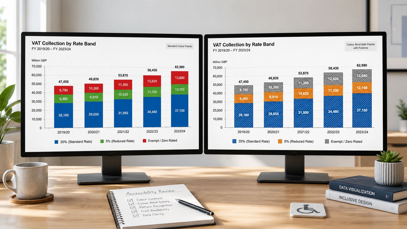
5. Prioritising Colour Accessibility in Financial Visualisations
You are presenting a month-end variance chart to a finance manager, and the only difference between “favourable” and “unfavourable” is red versus green. On your screen it looks clear. In a printed pack, on a projector, or for a viewer with colour vision deficiency, that meaning can disappear fast.
In finance, that is more than a design flaw. It slows review, creates avoidable questions, and can weaken confidence in your reporting. A bookkeeping summary, payroll exception report, or analyst dashboard should still make sense when colour is limited, washed out, or removed entirely.
Build meaning in layers
Colour should support the message, not carry the whole message by itself. A reliable financial visual works like a well-prepared ledger. If one cue is missing, the structure still holds.
Use direct labels, clear category names, symbols, pattern fills, or data markers so the reader can identify what matters without guessing. If red and green show overspend and underspend, add text labels such as “above budget” and “below budget” or use up and down icons beside the figures.
A simple check helps. View the chart in greyscale before you send it. If the key point disappears, the chart needs another cue.
For screen-based reports, contrast still matters. Text, legends, and small labels need enough separation from the background to stay readable. Teams building dashboards in Power BI can apply the same discipline they would use in a Power BI dashboard for financial reporting by checking whether every status colour also has a label, icon, or position-based cue.
Why this matters in UK finance roles
This is a practical career skill, not an extra polish step.
A junior bookkeeper who sends an accessible aged receivables chart makes review easier for a supervisor. A payroll administrator who marks exceptions with labels instead of colour alone reduces the chance of missed deductions or approval delays. A trainee analyst who designs accessible visuals shows the judgement needed for management accounts, client reporting, and board packs.
Employers notice that kind of judgement because it affects real working conditions. Reports are shared across teams, printed for meetings, exported to PDF, and viewed on different screens. Accessible colour choices show that you understand how financial information is used.
If you want a simple rule, use colour as reinforcement. Let labels, layout, and hierarchy do the main work.
Teams that already document system reliability in other areas often recognise the same principle here. The goal is to make issues visible before they cause confusion, much like teams that master cloud monitoring build checks so important signals are not missed.
Clear meaning beats colour dependence.
For learners on bookkeeping, payroll, and analyst pathways, this skill supports progression. Training courses can teach the software steps. Stronger candidates also learn how to present figures so colleagues can read them quickly, check them confidently, and act on them without hesitation.
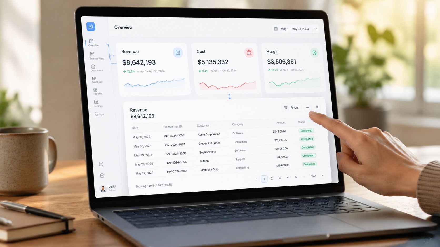
6. Structuring Interactive Dashboards and Drill-Down Capabilities
Interactive dashboards can be excellent in finance, but only when the structure is disciplined. Without that discipline, users click through filters, lose context, and stop trusting the output.
For an analyst, drill-down should feel natural. Start with a summary. Then open detail only when needed. A revenue dashboard might begin with quarterly totals, then allow a move into customer, product, or transaction level. A payroll dashboard might start with total departmental cost, then open overtime, deductions, or employee-level detail for authorised users.
A useful example appears below for anyone learning how dashboard layouts work in practice.
Build the path before the visuals
The most useful question isn't “What charts should I add?” It's “What should the user be able to answer first?”
Verified guidance notes a gap in many dashboard guides because interactive accessibility often gets missed. The UK Government material referenced in this area states that interactive elements such as sliders, tooltips, and hover states should be replaced with keyboard-navigable dropdowns and direct labels when needed for accessibility, described in this UK Government bite-sized guide to visualising data.
That's especially relevant if you're building reports in Power BI for public-facing or widely shared use. If you're still learning the platform, this guide to Power BI dashboards is a useful starting point for understanding how finance teams structure reports.
A broader operational mindset also matters in monitoring environments where users need fast, role-based views, which is why some teams study how to master cloud monitoring and adapt those layout ideas to business reporting.
7. Ensuring Dashboard Performance, Security and Information Architecture
A dashboard can look polished and still fail in practice. If it loads slowly, shows too much by default, or exposes sensitive data to the wrong people, users won't rely on it.
Finance reporting makes those risks more serious. Payroll data, employee earnings, supplier bank detail, and management accounts all need careful handling. An accounts assistant may need one view. A finance manager may need another. A trainee should never assume every user needs access to every level of detail.
Good architecture supports trust
Start with the model, not the front page. Decide what data belongs in the dashboard, how often it should refresh, and which users should see which records. Then build the visuals around those rules.
Useful habits include:
- Limit default data loads: Show summary results first, then let users request detail.
- Apply role-based access: Restrict payroll or employee-level data to the right users.
- Refresh outside busy periods: Avoid slowing down finance systems during key working hours.
- Review usage: If nobody uses a chart, remove or redesign it.
For trainees using Tableau, Power BI, Python, or R, platform knowledge matters because these are widely used tools for creating dashboards and charts in the UK market, as reflected in data visualisation course listings on Coursera.
In practical terms, a fast and secure dashboard tells colleagues that you understand more than chart design. You understand reporting as a business system. That makes a difference when you move from trainee tasks into analyst or reporting roles.
8. Applying Statistical Integrity and Avoiding Misleading Visuals
A trainee bookkeeper presents a monthly cost chart at review time. The wages line looks as if it has surged, and the room reacts fast. Then someone checks the scale and sees the axis starts far above zero. The payroll cost increased, but not by anything close to what the chart suggested.
That is a significant risk with misleading visuals in finance. A chart can stay technically based on correct numbers and still push the reader towards the wrong conclusion. In accounting and finance roles across the UK, that affects trust. If you want to progress from data preparation into payroll, reporting, or analyst work, your visuals must be fair as well as clear.
Make visual weight match numerical weight
The basic rule is simple. If one value is twice as large, the visual impression should also look roughly twice as large.
Errors frequently occur in these scenarios. Truncated axes can exaggerate movement. 3D effects can distort area and angle. Oversized markers can make small differences feel significant. In management accounts, budget-versus-actual reporting, or payroll summaries, those choices can lead a manager to focus on the wrong issue.
A safe habit is to test the chart like an auditor tests a schedule. Ask:
- Does the scale reflect the true size of the change?
- Would a busy manager read this quickly and reach the right conclusion?
- Have I shown variation accurately, without decoration that changes the message?
That discipline matters in professional training because it mirrors workplace expectations. A finance assistant may be trusted to prepare reports. An analyst is trusted to interpret them. Statistical integrity helps you move from one level to the next.
Show context, not just movement
A line going up is not enough. Readers need to know whether the change is large or small in pounds, percentage, time period, or business impact.
For example, a rise in payroll cost could reflect overtime, headcount growth, bonus timing, or a one-off correction. Without that context, the chart invites guesswork. In practice, that means adding direct labels, comparison periods, target lines, or nearby summary figures where appropriate.
Keep the absolute numbers close to the visual. If a finance manager asks, "What does that mean in pounds?" you should be able to answer at once.
That communication skill is part of career development too. Bookkeepers explain cash movement. Payroll staff explain pay changes. Analysts explain trends and exceptions. Training in presentation skills for professional reporting helps you present a sound chart with the clarity expected in meetings, interviews, and month-end discussions.
Avoid charts that create drama instead of understanding
Some chart styles add noise rather than meaning. Pie charts with too many slices, 3D columns, decorative icons, and compressed time scales often make finance data harder to read.
A good finance visual works like a well-laid ledger. It guides the eye to what matters and does not interfere with the numbers. If the design draws more attention than the evidence, simplify it.
Used well, visualisation strengthens professional judgement. It shows employers that you can handle figures carefully, explain them accurately, and support better decisions. That is a strong signal for progression into reporting, payroll analysis, and broader finance roles.
9. Optimising Visualisation for Multiple Output Formats and Devices
A chart that works on your laptop may fail in a printed report, a board slide, or a mobile summary. Finance professionals share the same information in many formats, so the visual needs to survive each one.
A payroll summary shown in a meeting room needs larger text than a worksheet used at a desk. A final accounts chart in PDF form must remain clear when printed. A dashboard viewed on a phone needs fewer details and stronger hierarchy than a desktop screen.
Design for where the chart will live
At this stage, many trainees improve quickly. They stop thinking only about how to build the chart and start thinking about where the chart will be read.
Use separate layouts where needed. A slide for directors should focus on headline movement and direct labels. A PDF appendix can hold more supporting detail. A mobile summary can lead with large numbers and a simple trend view. Screen-reader users also need alt text and accessible table alternatives where relevant.
Verified training guidance in this area also stresses hands-on learning with real datasets and practical Power BI use as a way to apply best practice, as shown in UK training guidance for real-world data visualisation practice.
One more point matters for career progression. The person who adapts the same financial story well for Excel, PDF, PowerPoint, and dashboard delivery becomes the person colleagues trust for reporting work. That's often how trainees move into broader analyst responsibilities.
9-Point Comparison: Financial Data Visualization Best Practices
| Item | Implementation Complexity (🔄) | Resource Requirements (⚡) | Expected Outcomes (⭐) | Ideal Use Cases (📊) | Key Advantages / Tips (💡) |
|---|---|---|---|---|---|
| Choosing the Right Chart Type for Financial Data | Moderate 🔄, requires chart literacy and initial setup | Low ⚡, uses built‑in features (Excel, Power BI, Tableau) | High ⭐, clearer comparisons and faster decisions | Comparing categories, trends, reconciliations, presentations | Choose chart by analytic goal; label axes and test with non‑financial users |
| Maintaining Data Accuracy and Source Integrity in Visual Reports | High 🔄, discipline, version control and reconciliations required | Moderate–High ⚡, governance tools and validation time | Very High ⭐, reduces errors; supports audits and compliance | VAT returns, payroll, statutory reporting and audit support | Use a data dictionary, live links and documented adjustment logs |
| Designing Visualisations for Your Specific Audience and Context | Moderate 🔄, audience research and multiple versions may be needed | Low–Moderate ⚡, design time; possible format variants | High ⭐, higher uptake and better decisions | Executive summaries, auditor packs, employee and regulator views | Interview users, create personas, lead with headlines and provide drill‑downs |
| Implementing Colour Theory and Design Principles | Moderate 🔄, requires colour theory knowledge and testing | Low ⚡, design effort plus simulators/tools | High ⭐, improved comprehension and reduced cognitive load | Dashboards, KPI tiles, branded reports and print materials | Limit palette, test with simulators, meet WCAG contrast standards |
| Prioritising Colour Accessibility in Financial Visualisations | Moderate 🔄, apply accessible palettes and alternatives | Low ⚡, colour‑blind tools and pattern/icon assets | High ⭐, inclusive visuals and regulatory compliance | Public reports, widely shared dashboards, regulatory submissions | Use colour‑blind safe palettes, pattern fills and Coblis/Color Oracle tests |
| Structuring Interactive Dashboards and Drill-Down Capabilities | High 🔄, information architecture, filters and drill paths needed | High ⚡, BI platforms, data engineering and ongoing maintenance | Very High ⭐, supports multi‑role exploration and fast insights | Multi‑role dashboards, transaction drill‑downs, near‑real‑time monitoring | Start with personas, apply progressive disclosure, test performance and security |
| Ensuring Dashboard Performance, Security and Information Architecture | High 🔄, data modelling, optimisation and security design | High ⚡, specialised skills, ETL/DB tooling and monitoring | Very High ⭐, responsive, trusted and secure dashboards | Enterprise BI, sensitive financial reporting, audited dashboards | Design data model first, use extracts/aggregations, implement role‑level security |
| Applying Statistical Integrity and Avoiding Misleading Visuals | Moderate 🔄, requires statistical literacy and careful checks | Low–Moderate ⚡, training, review and validation time | Very High ⭐, preserves trust and prevents poor decisions | Forecasts, public disclosures, executive performance reports | Use zero‑based axes when appropriate, show uncertainty and absolute numbers |
| Optimising Visualisation for Multiple Output Formats and Devices | Moderate 🔄, adapt layouts, accessibility and interactions per format | Moderate ⚡, testing across devices, alt text and format templates | High ⭐, consistent usability and compliance across channels | PDFs, slide decks, mobile dashboards, screen‑reader outputs | Create format‑specific templates, include alt text and test prints/devices |
Your Next Step From Theory to Practice
Mastering data visualization best practices takes practice, review, and repetition. Nobody gets every report right on the first attempt. The good news is that finance trainees improve quickly once they start matching chart choice, audience need, data control, and accessibility in one piece of work.
If you're training in bookkeeping & VAT, these skills help you explain return movements, supplier trends, and cash patterns more clearly. In advanced payroll, they help you present gross-to-net changes, overtime patterns, and deduction analysis with confidence. In accounts assistant and final accounts work, they help you turn month-end figures into reports managers can understand and act on. In business analyst and data analyst pathways, they help you move from raw extraction to real insight.
There's also a clear professional edge here. Employers often meet candidates who can enter data, reconcile figures, or follow a process. Fewer candidates can also present financial information in a way that is clear, accurate, accessible, and persuasive. That combination makes you more useful in interviews and more valuable at work.
The tools matter too. Excel remains central in many finance roles, but employers also value people who can work with Sage, Xero, QuickBooks, and Power BI. Training with those tools is strongest when it includes real reporting tasks, not just software clicks. You learn more by building a VAT dashboard, a payroll variance report, or a month-end pack than by watching features in isolation.
Structured training can shorten that learning curve. With expert guidance, you can get feedback on your chart choices, your data control process, your layout decisions, and your reporting language. That's especially helpful if you're changing career, returning to work, or entering the UK job market for the first time.
It also helps to study how visual reporting works beyond finance, because strong communication principles often transfer across functions. For example, teams building visualisations for marketing reports still face the same need for clarity, hierarchy, and audience fit.
The next step is simple. Don't just read about good reporting. Build it. Take one real finance scenario, such as a VAT quarter, a payroll run, or a final accounts movement, and present it in a chart that a non-finance colleague can understand in seconds. Then improve it again. That cycle is how theory turns into job-ready skill.
Professional Careers Training helps you turn these ideas into practical, employable skills through hands-on courses in Bookkeeping & VAT, Advanced Payroll, Accounts Assistant, Final Accounts, Business Analysis, and Data Analysis. You'll train with ACCA qualified Chartered Accountants and CPD approved trainers, work with tools such as Sage, Xero, QuickBooks, Excel, SQL, Python, and Power BI, and get flexible support that fits around weekday, evening, or weekend study. If you want more than theory, and you want guided practice, certification support, CV preparation, career coaching, and help connecting with employers, Professional Careers Training is a strong place to start.

